


The latest standard for Cascading Style Sheets can be implemented with helpful development tools to create IBM i web applications that run well on multiple devices.
Have you started using CSS3 for your mobile apps? CSS3 lets you create modern, adaptable web applications, eliminating the requirement of dealing individually with the breadth of devices under the mobile umbrella. Along with HTML5 and JavaScript, CSS3 allows for clean separation of document content from document presentation and interactivity. HTML5 contains your content and includes links to CSS3 for presentation and formatting, while JavaScript provides the interactive logic.
Cascading Style Sheets (CSS)
For the uninitiated, CSS stands for Cascading Style Sheets. CSS saves a lot of work by specifying exactly how HTML elements will look when displayed in a browser. CSS greatly improves consistency and reduces manual development effort. The "cascade" notion is key to their use, since you can use multiple CSS files, and within each file, you can have multiple entries governing the look of an HTML element. Either the latest or most precise definition in your CSS is the one that will be applied to the element. This is referred to as "specificity," and it's the only really complex part of learning CSS. I've linked here to a good explanation of specificity.
Available since 1996, CSS3 is actually multiple specifications, most of which have been mainstream since 2012. CSS3 was designed to provide richer and more flexible presentation control and to help you author content once and then easily optimize it for all devices—smartphones, tablets, desktop, and printer.
Some recent changes to HTML5 allow for much better separation of the layers. In the past, a Class tag was applied to content. This enabled CSS to style, format, and position the content effectively, but this Class tag was often used to attach JavaScript to the element, which led to technical issues and either multiple class names for a simple element or specific names to allow the scripting to apply in set circumstances. In HTML5, we can now use the Data tag, which enables the Class tag to be used by CSS and the Data tag for JavaScript.
Build Once, Deliver Anywhere
CSS3 is key to the delivery of mobile web and hybrid applications, as it allows for a "build once, deliver anywhere" approach, rather than having separate pages for device size. The idea of separate pages might not sound terrifying, but it should, since there are literally hundreds of device sizes today—more that anyone could possibly keep up with.
CSS is a wide subject, and in this article we'll mainly stick to the parts that make it easy to build mobile applications. We'll also touch on a few other pieces of the puzzle that are not actually CSS but are key to a good implementation. For example, tools are available that greatly simplify CSS3 implementation.
Two Key Mobile Notions
Before we get further into CSS, there are a couple of mobile development items you should understand up front:
1) Pixels are not always pixels.
Headlines and marketing specs for devices now show full HD screens as 1920 x 1080 or higher, but if you look at the web page properties, you will find the page is often still around 598 x 360. The high count of many retina class displays allows fonts to be crisp, but we're really talking about the native resolution of the screen as subpixels for text and non-image or video items. When you develop, the actual pixel dimension of devices should not be your design goal. Rather, you should concentrate on the size the browser sees when it's loading. Matt Stow has some great examples of this on his site.
2) Pinch and default zoom.
Many web pages today are still not optimized for mobile. They often zoom out automatically from their natural resolution so you have a sense of the page and can zoom in. This needs to be fixed for a mobile application so the page runs at the size it was designed for. The pinch-to-zoom feature, while useful for standard web pages, will get in the way of the user interaction and delay touch events while the device checks to see if you are tapping or pinching.
Mobile OS vendors using WebKit (iOS and Android) have solved this with some simple view part MetaTags in the HTML head, giving you complete control of the zoom scale and letting you specify how pinch-to-zoom works.
For example:
<meta name "viewport" content "width=device width user-scalable=no"/>
This ensures the device will zoom into the actual size of its browser width (100%), and pinch-to-zoom will be disabled.
Other viewport tags such as mobile-webapp-capable and web-app-title help you further optimize the device to run full-screen and add a home screen icon with a title in the same way as a native mobile application. Check out GoogleDevelopers for some great extra info.
Getting Started with Media Queries—One of the Keys to Flexible Mobile Layout
One key to building a flexible mobile layout is "media queries," which allow CSS to be targeted to specific device attributes. Media queries make it possible to define different style rules for different media types in the same stylesheet without changing content.
Media queries have an initial filter; for mobile and desktop the filter is screen, but there are others such as print, projection, tv, and all. You can then add further filters listed in the W3C Spec and the excellent Mozilla Developer Network. For mobile, you can also use device-pixel-ratio, which enables you to use different images often referred to as retina displays. While there are many items you can use, it typically will be min-device-size, max-device-size and device-pixel-ratio that allow you to target CSS to your device.
Media queries are always at the start of your CSS file; a simple example is shown below:
@media screen and (min-width: 500px) and (max-width: 800px){
.header{display:none;}
}
The only real gotcha is the extra set of curly brackets enclosing each of the media queries, so stick to using a quality editor (Sublime Text, Notepad++, or Brackets) rather than Notepad to ensure you get it right. You can use media queries to deal with the main mobile (and desktop) forms quite easily. You don't have to deal with every single device size, just smartphone portrait, smartphone landscape, tablet portrait, tablet, and landscape. These easily fit witin a range. If you want to do this yourself or learn how to set the breakpoint, I would recommend checking out Andy Clarke's excellent 320 and up.
Cheaters Never Prosper?
Screen size is the main issue that people struggle with when researching mobile. There are just so many screen sizes! Even with break points, how do you deal with all the subtle differences in size? Well, the simple answer is: we cheat.
Consider a design for a portrait orientation smartphone: you have two dimensions, both of which are different by device, OS version, manufacturer skin, and browser. It would seem easier to give up and go home, but don't leave just yet! CSS has some great tricks up its sleeve to help out. The vertical plane is less of an issue as users expect to vertically scroll. What you need to do is understand what will be the minimum area above the fold (seen without scrolling) so you can ensure you either don't need to scroll or if you do, key info is available without scrolling. This number changes as smartphones get bigger, but you can typically use 400px vertically even on older devices.
The device width varies much more, especially in Android devices, but if you use percentages, this is less of an issue. The width you can safely use for any device implementation is 320px. This sets how you test your screens. With many devices now being 360-400px wide, there isn't enough space to want to do anything differently; it's just about fitting the form factor well. If text and fields are left-aligned (and they always should be), you end up with extra whitespace only to the right on a wider device. For elements such as tables (subfiles), images, and the like, instead of specifying a set width in pixels, just set the item width and any required padding and margin as a percentage. Think of a simple table at 95% of the screen width; if it works at your minimum 320px, it will just be slightly wider but still centralized at a higher device width.
Using a combination of media queries and percentages gives you a smartphone layout that runs single column and a landscape tablet layout that runs in two columns—without any change to the HTML code. This takes some thought and setup but allows for content to reflow based on the device. It's also important to note that you may build in navigation and headers, which can be completely different or even hidden, depending on the device form factor. Using just CSS, it's possible to deliver a single page that looks and possibly works differently all the way from the smartphone to the desktop. Responsive design is all about "write once, deliver many." It requires more upfront thought but allows for a single effort and easy maintenance and future-proofing as devices emerge. It's not the answer to every problem, of course; there are situations where you may wish to have separate deliverables to finely tune the experience, but even in this case you will still end up with media queries for orientation and device pixel density unless you target only a single manufacturer's device. Check out the CSS-Tricks site and the excellent dConstruct.org and size your browser window to see responsive design in action. Note it deals with not only the sizing but also position and layout.
Frameworks Can Help—Bootstrap and jQuery
At about this point, you may very well be thinking "this isn't for me," but don't give up yet! There are many frameworks to help with building mobile applications. These frameworks remove much of the effort and learning curve and provide styling and consistency out of the box. I would still recommend any IBM i developer learn HTML5, CSS3, and JavaScript as the basic languages of the web, but building it all manually is very much behind the times.
The multitude of frameworks out there today range from free to paid to commercial to open source. You can research which ones best fit your situation, but I'll talk about two of the biggest and explain what they do for you.
1) Bootstrap is a free, open-source framework originally created by the folks at Twitter to provide consistency across their internal applications. In March 2015, it became the most-starred project on GitHub (the world's most popular code host), which speaks volumes about its quality and ease of use. Bootstrap enables you to create web applications using clean, simple, and human-readable HTML. It handles responsive design, layout, consistency, and quality in a very human-friendly manner. When people go it alone, they always build items over and over, which becomes impossible to maintain in the long term. An item as simple as a button needs to be visually pleasing and consistent. Using Twitter as an example, making a button is extremely simple, as shown below:
The HTML code to create a simple button:
<button type="button">Primary</button>
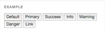
Figure 1: Standard HTML buttons look like the ones above.
With Bootstrap, only a simple class needs to be added to fully style the button. This button will be consistent with every other button in the application.
<button type="button" class="btn btn-primary">Primary</button>
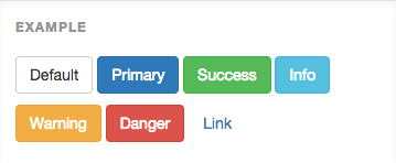
Figure 2: With a simple Bootstrap class, the buttons are fully styled.
Bootstrap provides a comprehensive set of styling and layout options with great ease of use and strong community behind it. Check it out at getbootstrap.com.
2) jQuery is known across the worldwide developer community as the most widely used JavaScript framework today. An offshoot project is jQueryMobile, a fantastic framework that's specifically built for mobile. It uses CSS3 for a great look, layout, and consistency but implements it in a very different way, using the HTML5 data attribute to let you easily control elements with both CSS3 styling and any required JavaScript.
Here's another simple button example. Without CSS, it would be this:
<button>Next</button>
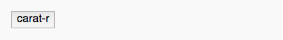
Figure 3: Again a simple HTML button is shown above.
When the data tag is added, the button is fully styled:
<button data-icon="carat-r">audio</button>

Figure 4: The image above shows that jQuery Mobile adds both styling and sizing to ensure great looks and touch-friendly usability.
If you inspect the element, the data attribute has allowed the injection of the relevant CSS code as below:
<button class="ui-btn ui-shadow ui-corner-all ui-btn-icon-left ui-icon-carat-r">audio</button>
jQuery mobile, like Bootstrap, uses clean, simple, human-readable HTML5 code for the content and eliminates the effort of creating a mobile-optimized application.
With any framework, you'll have to learn the specific attributes or classes, but as a quick test I built a simple application page (HTML and CSS) for a smartphone, first manually and then with these frameworks. To work from nothing took the best part of a day to build a simple page, whereas both frameworks helped me build the same form in about 20 minutes (with a little help from their website examples). You would obviously get faster building your own as you only need to create a set of button classes once, but the consistency, cross-browser support, and ease wins every time, and there's nothing stopping you from using a framework while creating your own items for specific needs.
In a world where new devices appear every day and new operating systems unheard of yesterday spring up quickly, using a framework takes much of the pain, effort, and worry out of building mobile applications.
Frameworks also deal with one very important point for IBM i developers: they remove the need to worry about the graphic design and the quality of styling. As long as your HTML code is consistent, your application will look and feel great with virtually no effort on your behalf.
CSS3 and modern framework tools provide the ability to deliver flexible, responsive, good-looking mobile applications from your IBM i. And modern mobile browsers and hardware accelerate much of what CSS3 can do so that applications will be quick to load and responsive to use. Many "native" applications today use HTML and CSS3 for much of their content and all hybrid applications are just a browser wrapper with APIs. The true advantage of using HTML5 and CSS3 is that you can build once and delivery many because building separate apps for tablet and smartphone on Android, iOS and Windows as well as desktop or web is just not a viable option. User needs will always vary, but the web is here to stay. Long live CSS3!


 More than ever, there is a demand for IT to deliver innovation. Your IBM i has been an essential part of your business operations for years. However, your organization may struggle to maintain the current system and implement new projects. The thousands of customers we've worked with and surveyed state that expectations regarding the digital footprint and vision of the company are not aligned with the current IT environment.
 TRY the one package that solves all your document design and printing challenges on all your platforms. Produce bar code labels, electronic forms, ad hoc reports, and RFID tags – without programming! MarkMagic is the only document design and print solution that combines report writing, WYSIWYG label and forms design, and conditional printing in one integrated product. Make sure your data survives when catastrophe hits. Request your trial now! Request Now.
 Forms of ransomware has been around for over 30 years, and with more and more organizations suffering attacks each year, it continues to endure. What has made ransomware such a durable threat and what is the best way to combat it? In order to prevent ransomware, organizations must first understand how it works.
 Disaster protection is vital to every business. Yet, it often consists of patched together procedures that are prone to error. From automatic backups to data encryption to media management, Robot automates the routine (yet often complex) tasks of iSeries backup and recovery, saving you time and money and making the process safer and more reliable. Automate your backups with the Robot Backup and Recovery Solution. Key features include:
 Business users want new applications now. Market and regulatory pressures require faster application updates and delivery into production. Your IBM i developers may be approaching retirement, and you see no sure way to fill their positions with experienced developers. In addition, you may be caught between maintaining your existing applications and the uncertainty of moving to something new.
 IT managers hoping to find new IBM i talent are discovering that the pool of experienced RPG programmers and operators or administrators with intimate knowledge of the operating system and the applications that run on it is small. This begs the question: How will you manage the platform that supports such a big part of your business? This guide offers strategies and software suggestions to help you plan IT staffing and resources and smooth the transition after your AS/400 talent retires. Read on to learn:
LATEST COMMENTS
MC Press Online